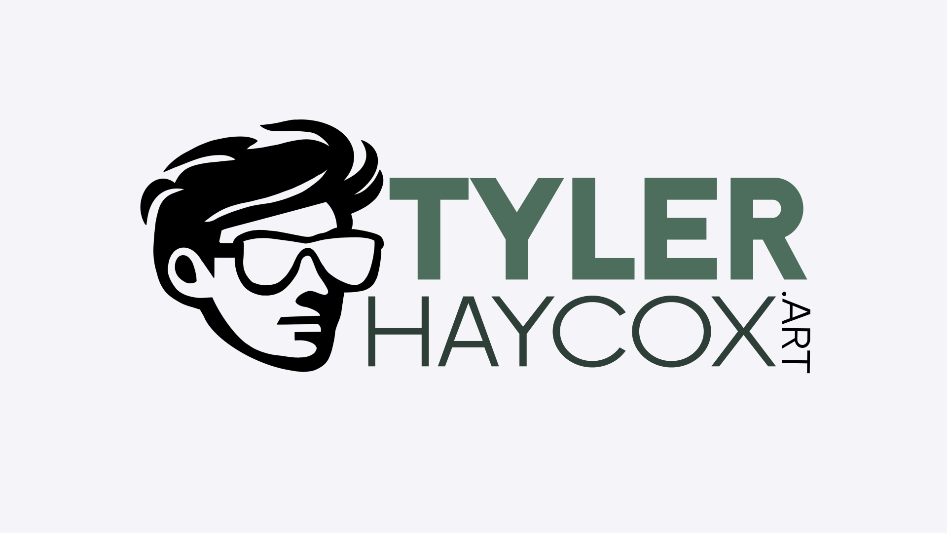
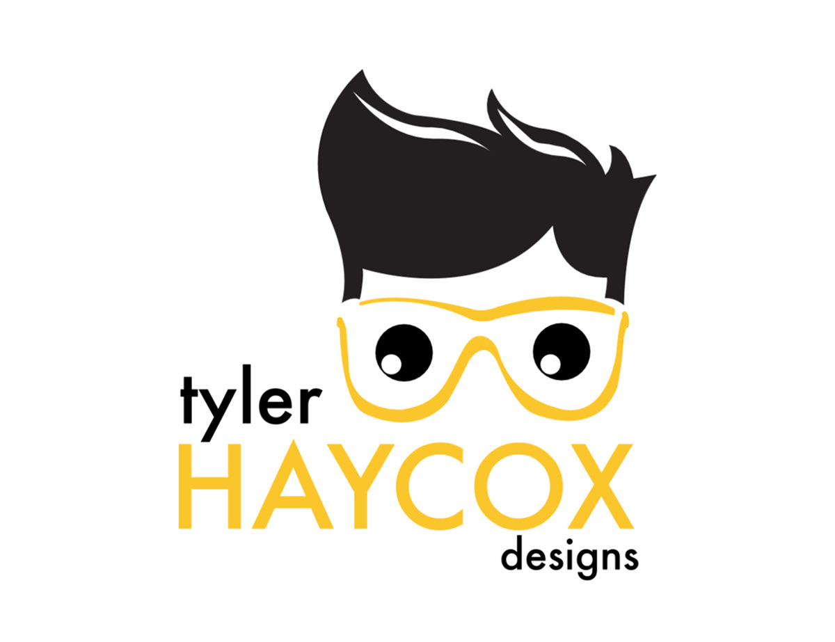
Step 01 - Looking at the Past
As part of my ongoing design growth, I decided to refresh my logo to reflect my professional identity better. I began by analyzing the original design and identifying the elements I liked and wanted to preserve. From there, I explored ways to elevate the logo, refining it to embody a more polished and professional aesthetic while maintaining the essence of the original concept. This redesign showcases my evolution as a designer and my commitment to creating a brand that aligns with my expertise and creative vision.
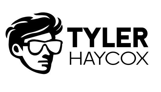
Step 02 - Redesigning the Icon
Building on the concept, I focused on maintaining the core elements that defined my logo—my signature glasses and hairstyle—but opted for a cleaner, more refined approach. I experimented with negative space and subtle details to create a refreshed yet recognizable face character. To bring this vision to life, I sketched a continuous line design on my iPad, ensuring all elements are interconnected seamlessly. Once the structure was in place, I filled the space with black, adding contrast and depth to establish a bold foundation for further refinement. This iterative process allowed me to balance creativity with clarity in my updated logo design.


Step 03 - Adding in the Text
With the icon finalized, it was time to integrate the text. I decided to emphasize my first name with a bold typeface while opting for a thinner font for my last name, creating a visual contrast that balanced the text and the graphic. To refine the overall composition, I explored different placements, testing versions where the text connected to the icon and others where it stood apart. Ultimately, I chose a layout where the text and icon remained separate. This spacing allowed the design to breathe, giving it a clean and modern feel without overcrowding the elements. The result is a logo that feels cohesive, professional, and distinctly me.
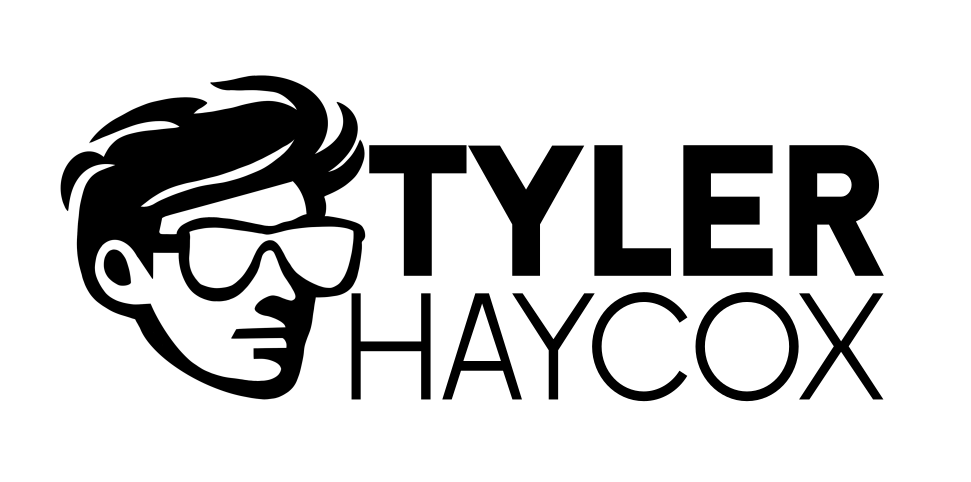

Step 04 - A Splash of Color
Now, it was time to introduce color. With a carefully selected color palette in mind, I aimed for a hue that would make the logo pop without overwhelming the viewer. I chose a green color family, as it felt vibrant and pleasant—exactly the kind of energy I wanted my brand to project. After finalizing the color, I took a step back and realized the logo could be further elevated by incorporating a nod to the services I offer as a freelancer. To do this, I decided to subtly integrate ".art" or "creative" into the design, adding a layer of meaning to the logo while reinforcing my focus on artistic and creative work. This addition brought a new dimension to the logo, making it not just a visual identity, but also a representation of my professional offerings.